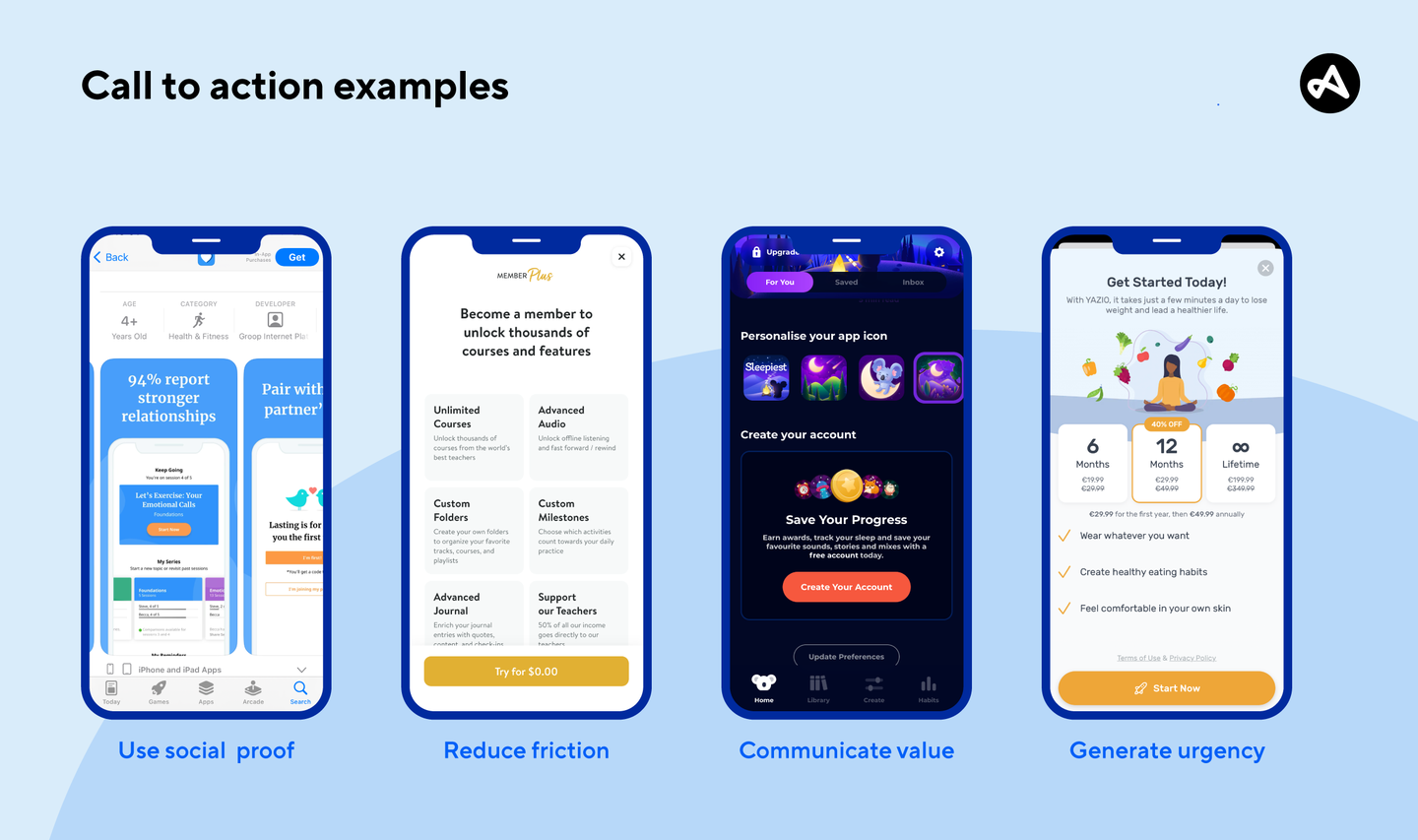
What is a call to action (CTA)?
CTA definition
What does a call to action mean?
A call to action (CTA) is a short grouping of words designed to prompt an immediate response from the reader. CTAs are used by marketers in app store listings, website landing pages, ads, push notifications, email marketing campaigns, and throughout the in-app user journey to guide users to take a specific action. For example, purchasing, signing up, downloading, or completing any other desirable goal.
How to
How to write a good call to action
Creating an effective CTA involves combining strategy, creativity, and an understanding of your audience's needs and behaviors. Here are some tips for how to make a call to action:
- Work backward: Start by identifying your goal. What action do you want your audience to take? For example, downloading your app, signing up for a newsletter, making a purchase, registering an account, accessing content, completing a survey, following your social media profiles, and more.
- Use actionable language: Verbs that encourage action are a must. Ensure the language is clear, concise, and compelling.
- Create urgency: If appropriate, create a sense of urgency by adding words like “now” or include phrases such as "limited time offer" or "offer ends soon" near your CTA to encourage immediate action.
- Consider design: Make sure your CTA stands out visually. Use contrasting colors, bold text, and an easily noticeable size without being overwhelming. If it's a button or link, ensure it's placed in a prominent location on the page.
- Make it short and sweet: Ideally, a CTA should not exceed 5 to 7 words to ensure clarity and prompt action.
- Keep it simple: Avoid using overly complex or technical jargon that could potentially confuse or alienate the user.
In addition to these basic principles, you can also take your CTA up a notch with the following tips:
- Provide value: Clearly articulate the benefits the user will receive by taking action.
- Include social proof: If possible, include social proof like testimonials or user reviews near your CTA to build trust and encourage action.
- Craft a frictionless journey: Following through on the CTA should be straightforward and simple. Avoid any cumbersome steps that may deter the audience from taking action.
Writing effective CTAs is a skill that can significantly enhance your marketing, sales, and engagement efforts. By combining compelling language, good design, and a clear value proposition, you can create a call to action that drives desired actions from your audience.
Examples
Call to action examples
Depending on your objectives, and where in the user funnel you are placing your CTA, there are a variety of phrases you can use. Here are just a few examples of CTAs to get you started:
- Sign up for free
- Add to cart
- Get instant access
- Experience premium now
- Unlock exclusive savings
- Become a member today
- Subscribe and save
- Secure your spot
- Activate offer
- Join 10,000+ happy subscribers
- Access exclusive content
And here are a few examples with a little more pizazz, that you could use in A/B testing:
- Get a taste (Think: Food delivery or recipe apps)
- Find your beat (Think: Music apps)
- Start your transformation (Think: Health and wellness apps)
- Master your finances (Think: Fintech apps)
- Embark on a quest (Think: Gaming, fitness, or education apps)
- Uncover hidden gems (Think: Travel or discovery apps)

Adjust
Adjust and CTA measurement
Use analytics tools like Adjust to track the performance of your call to action. Analyze click-through rates (CTRs), conversions, and other relevant metrics to improve your CTA strategies continually. A/B testing different CTA texts, styles, and placements can further help you understand what works best for your audience. Test different languages, designs, and placements to find the most effective call to action.
Learn how Adjust can help you measure the effectiveness of your app’s CTA buttons–request a demo today. (Pssst, that was a call to action!)
Be the first to know. Subscribe for monthly app insights.
